In a world where usability is essential for digital experiences, there are numerous UX principles to consider. Among these, we have chosen four that we find particularly important: Jakob’s, Hick’s, Fitts’, and Miller’s laws. These principles emphasize the importance of creating intuitive interfaces that make it easy for users to navigate and make decisions without unnecessary friction.
In this article, we explore how these selected psychological principles can be applied to reduce complexity and increase user engagement. We provide practical strategies for simplifying design and maximizing conversions. Whether you are a designer, developer, digital marketer, or simply curious about user experience, you will gain insights that can enhance your work and help you create more user-friendly products.
What is Jacob's Law?
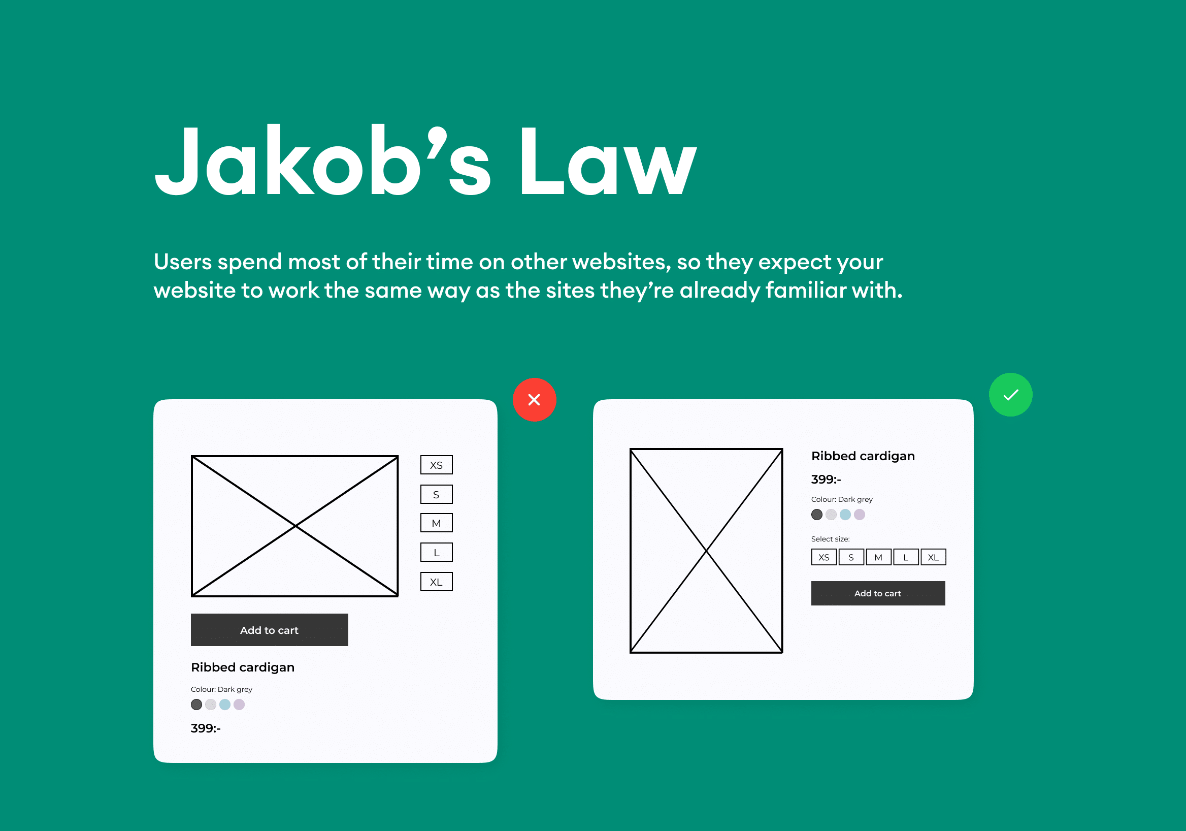
Jakob’s Law, formulated by usability expert Jakob Nielsen, states: “Users spend most of their time on other websites, so they expect your site to work the same way as all the other sites they already know.” Users have expectations for how a website should function based on their experiences with other sites.
How to apply Jakob’s Law:
By following well-established design principles, you can reduce the learning curve and make it easier for users to navigate your website or app. For example, use the same placement for menu buttons as most other sites and maintain consistency in the structure of headers and footers. It’s also important to maintain familiar navigation logic—a search function, for instance, is typically placed in the upper right corner.

What is Hick’s Law?
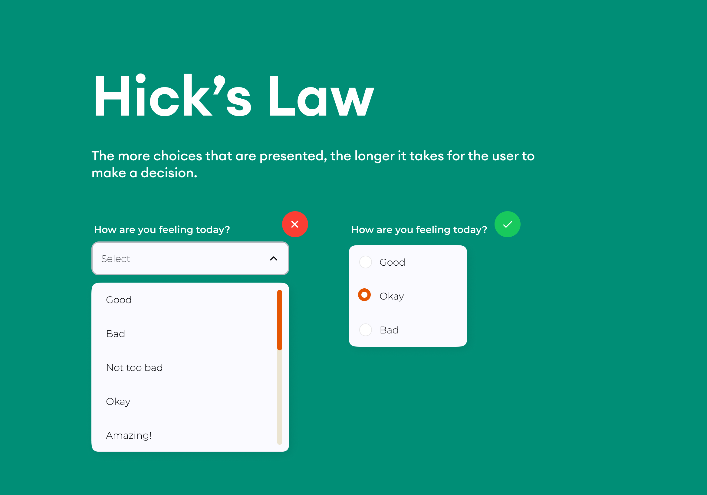
Hick’s Law, or the Hick-Hyman Law, explores the relationship between the number of choices offered and the time it takes to make a decision. The more options presented, the longer it takes for the user to choose. This principle can help designers minimize cognitive load and facilitate decision-making.
How to apply Hick’s Law in UX design:
- Limit Choices: Display only the most relevant options. Instead of offering five different subscription plans, consider showing three carefully curated choices.
- Organize and Group Information: Group similar items and functions to make interaction more predictable and reduce cognitive load.
- Break Down Complex Tasks: If a task involves multiple steps, present them one at a time. This approach works particularly well in checkout processes and long forms.

What is Fitt's Law?
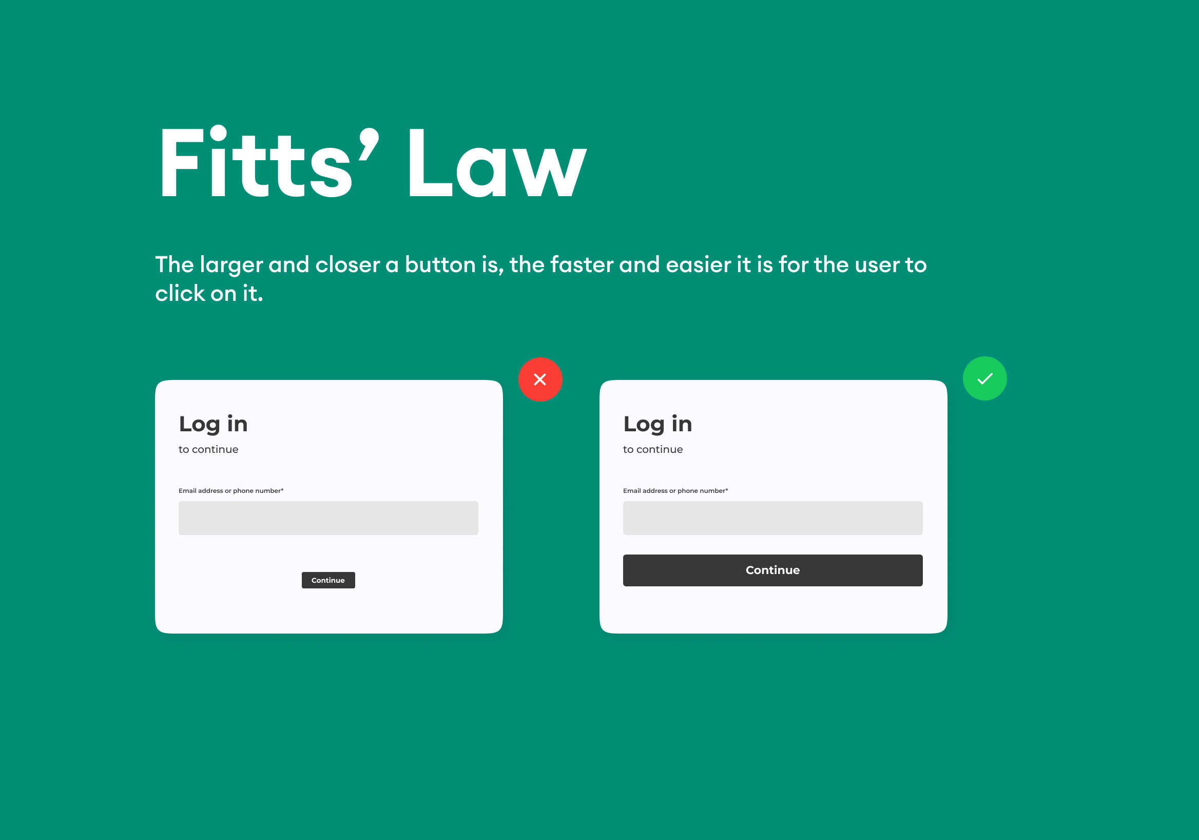
Fitts’ Law explains how the size and distance to a target affect the time it takes to reach it. The principle states that the larger and closer an interactive button is, the faster and easier it is for the user to click on it. A user-friendly design requires buttons and other interactive elements to be both easy to find and easy to click.
How to Use Fitts’ Law in design:
- Make interactive elements larger: Ensure that call-to-action buttons, navigation icons, and other key elements are large enough for users to click easily on various devices.
- Reduce distance to important objects: Place important buttons close to each other or in areas that are easy to reach. For example, a call-to-action can be placed near the headline and description to encourage interaction.
- Avoid accidental clicks: Ensure there is enough space between clickable elements so that users do not accidentally press the wrong button.

What is Miller’s Law?
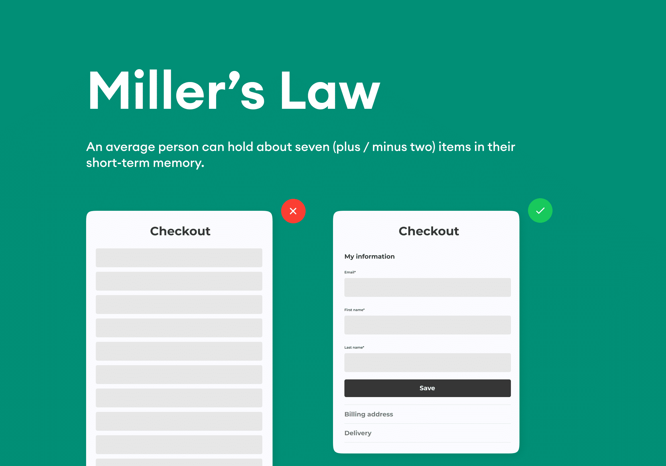
Miller’s Law addresses the human limitation of processing multiple pieces of information simultaneously. The law states that the average person can hold about seven (plus or minus two) items in their short-term memory at once. If a design overwhelms the user with too much information, it can feel cluttered and difficult to navigate.
How to apply Miller’s Law in UX design:
- Group and organize information: Divide information into logical groups to reduce the number of individual elements the user needs to focus on at any given time.
- Avoid excessive information: Stick to the most relevant content and keep the design as simple as possible.
- Use visual hierarchy: Highlight the most critical elements and help users focus on what is most important without being distracted by unnecessary information.

Create effective and user-friendly design with these principles
By applying Jakob’s, Hick’s, Fitts’, and Miller’s laws to your design, you can create products and websites that are intuitive and user-friendly. Remember that design should always prioritize user needs and that simple, clear interfaces are more effective than complicated solutions. With these principles in mind, you can enhance user experience and ensure your product engages and guides users in the best way possible.
Understanding user expectations, minimizing decision complexity, adjusting the size and placement of elements, and optimizing information load will give you the keys to creating a design that both attracts and facilitates the user.


