About the company and the project
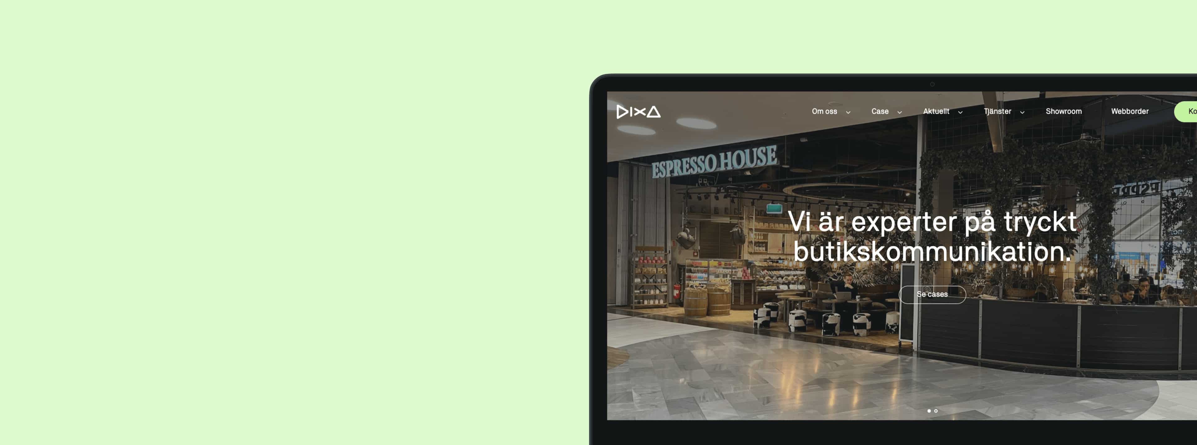
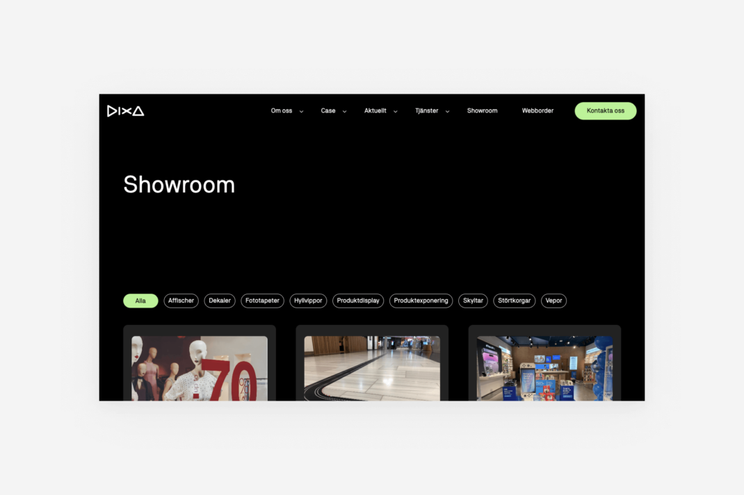
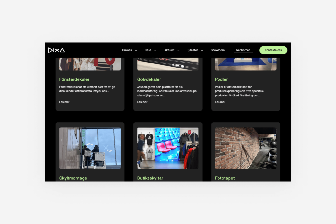
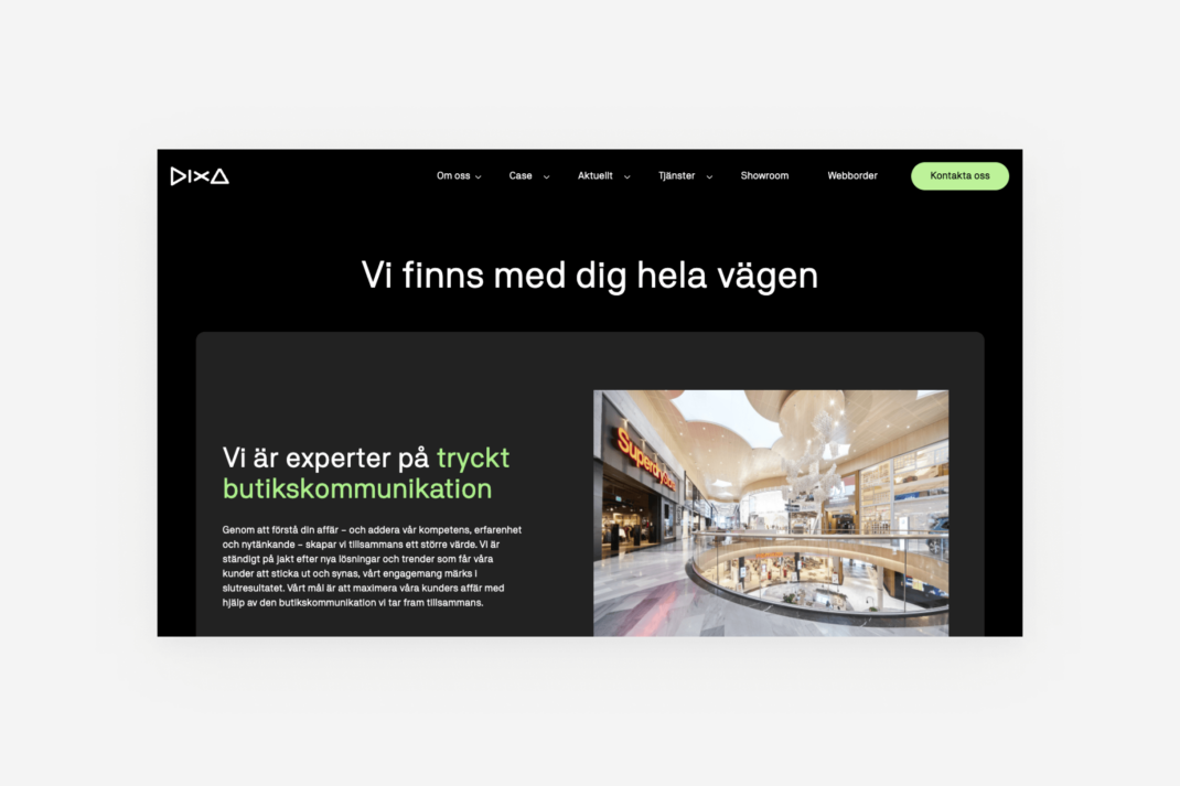
Dixa is a company that specializes in in-store communication within the retail sector. They tailor visual messages for their clients, which generate profitability and reach the intended target audience right where they are, whether it's in shopping centers, storefronts, or other physical locations. Dixa's products range from wallpapers to banners and in-store communication materials. Dixa also has a subsidiary, Greenlite, which was also involved in the project.
The project began with sketching the site structure, UX, and design for Dixa's new website. Once this was completed, a similar website was designed for Greenlite. The two websites make up a multisite setup: one theme for two different sites, where each can be filled with content that matches each company's needs.
Client
Dixa
Services
Development, SEO, UX, Website
The challenge
The project commenced in September 2022. One challenge was that Greenlite's original website was not mobile-responsive, while Dixa's website was difficult to administer and required a lot of manual work. This meant that we needed to design two integrated websites that could be efficiently managed.
Since Dixa manufactures everything to order for its customers, we had to think carefully about how to build the site based on this information. Both the structure and content of the website had to be constructed accordingly. To successfully address these issues, specialists from our team in SEO, design, and development were required. The solution was to present Dixa's services through a drop-down menu instead of products.
The result
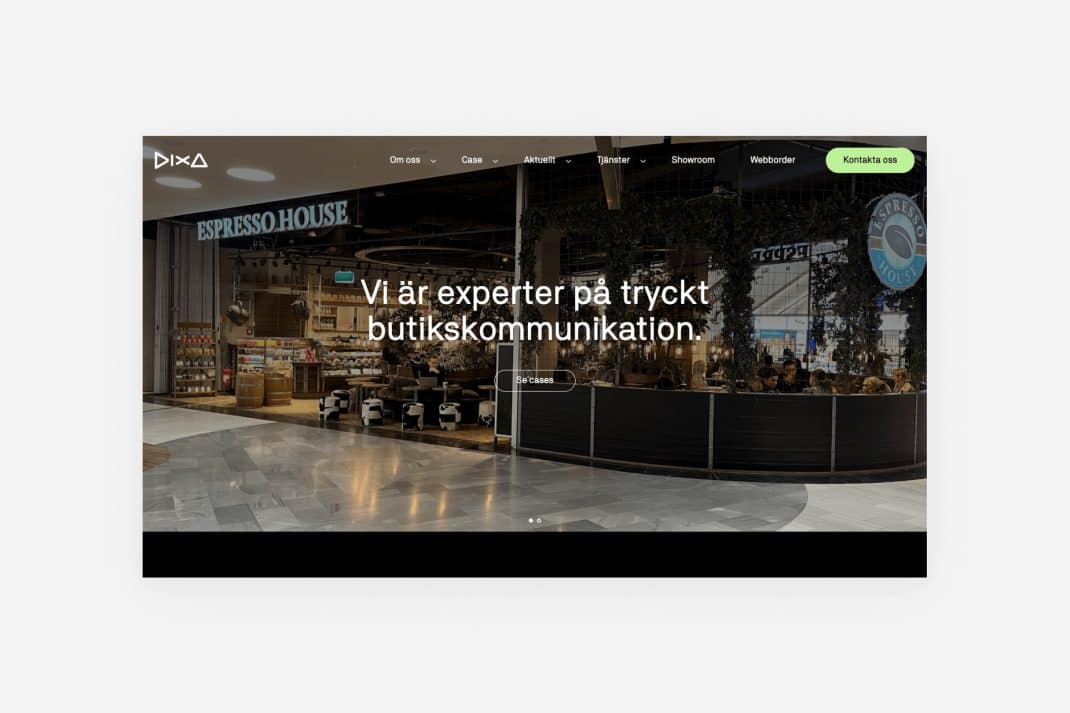
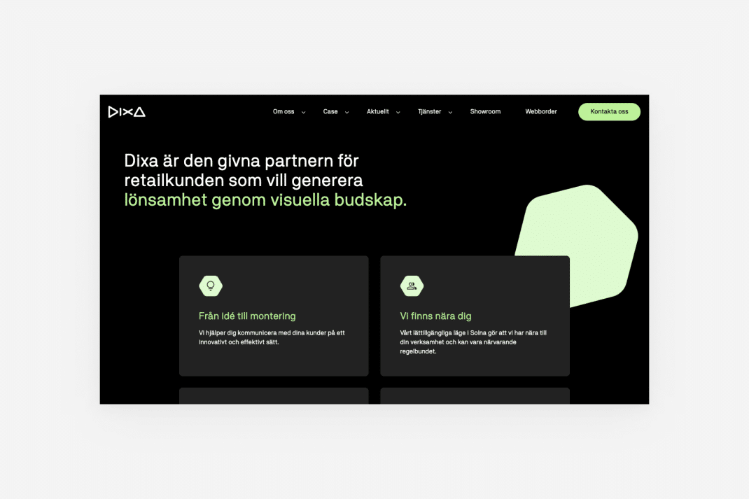
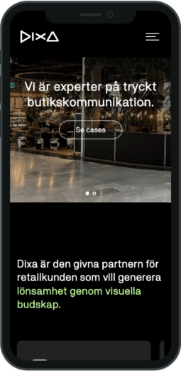
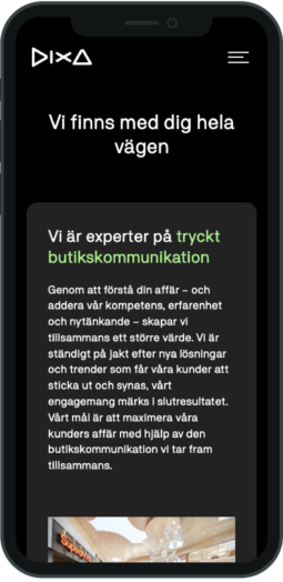
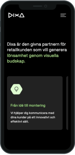
The result was two unique websites optimized for both mobile and desktop. Greenlite's website was made available in both Swedish and English, while Dixa's website was only available in Swedish. The websites are now current and updated according to the latest standards. Dixa's distinguishing services are clearly visible in a menu on the homepage with explanations of each service. Visitors quickly find what they are looking for, whether it's store signage, store campaigns, or a shop-in-shop solution.
Dixa's website received a more service-oriented focus than product-oriented. Therefore, the new website presents solutions to the problems that Dixa's customers experience – through the new features and the easy-to-navigate menu. Dixa also requested not to publish dates on their newly written articles to keep the content relevant for as long as possible. This resulted in us removing dates and times for all upcoming and current articles.
The collaboration between us at Mild and Dixa has been effective from the start, with goals achieved according to the schedule. When the two websites were integrated, the overall experience improved – tailored according to both brands, but with a common foundation. Dixa now has all the tools and structure needed to continue expanding its online presence, and we are proud to have been part of it.
Annie"The two websites for Dixa and Greenlite now provide a solid foundation to build upon. We look forward to seeing Dixa grow its business with these opportunities."
Production Manager, Mild
Curious about the project and want to learn more?
Don’t hesitate to contact us for further details.
